


We are in Sirkeci, which is one of the most cosmopolitan districts of Istanbul. While working on Peak, whose corporate identity along with its architectural project and application was designed by us, we tried to create different corners in a small shop. Inspired by the neighborhood we are in, we designed a dynamic, surprising, fun place that appeals to everyone, so that you will see a completely different world every time you turn your head around.
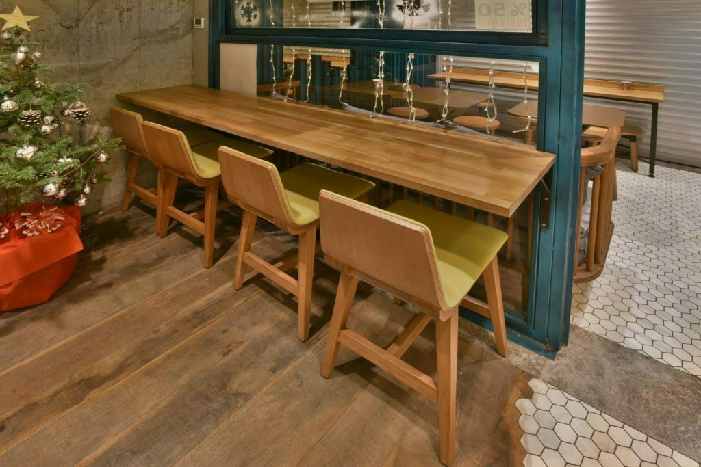
At Peak’s desks and chairs designed and manufactured by us, we used Scandinavian simplicity and calmness. We found a balance with the simplicity of the chairs in this colorful, cheerful, lively shop. We preferred light wood on the tables we designed in angular forms such as triangles and rectangles. We placed small marble mosaics on the floor along with wood. The craftsmanship and application of this floor required a lot of care and daintiness. We applied asymmetrical transitions to the floor, and it added an elegant and vibrant feeling to Peak.
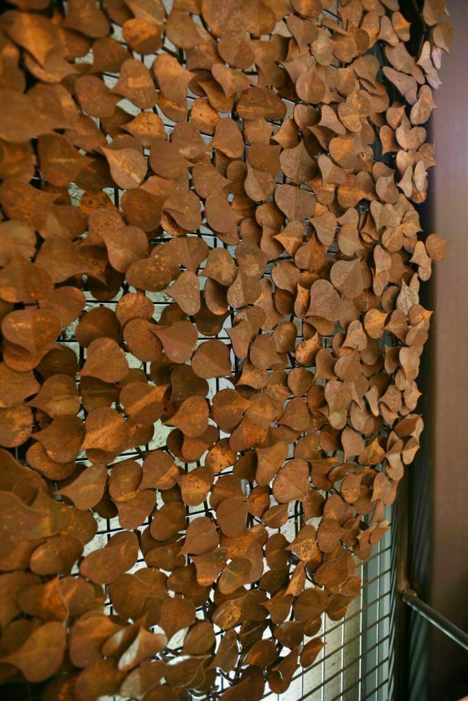
While choosing Peak’s lighting, we also opted for specially designed lamps placed on each table, in addition to the lighting fixtures that we are used to see in cafes. We placed miniature versions of the old street lamps on each table, which we are familiar to see in the squares of Sirkeci, one of the oldest districts of Istanbul. While decorating the walls, we included graffities like many other projects, but we did not limit ourselves to this. For example, by placing a ivy made of metal on a wall, we brought the nature and the street to the shop. On the exterior of Peak, we created a turquoise-colored aging façade.
By pulling the façade inside, we created an outside seating area. We designed the nostalgic image of the façade, which we designed in a color, which creates a contrast with the multicolored universe of Sirkeci, again inspired by the district. We used the logo of Peak, whose corporate identity was also prepared by us, with different applications both inside and outside the venue. Based on the idea of visualizing the brand’s name, we preferred a plain typography in the logo we illustrated.
We also implemented the logo on Peak’s cardboard cups and other materials. We always say, we love to treat a brand with all its elements from its logo to its architectural project, and to embrace it as if we were opening our own shop!